As part of #GAAD, this week we’re sharing accessibility stats & tips from Wagtail sites.
Accessibility checks on Wagtail sites
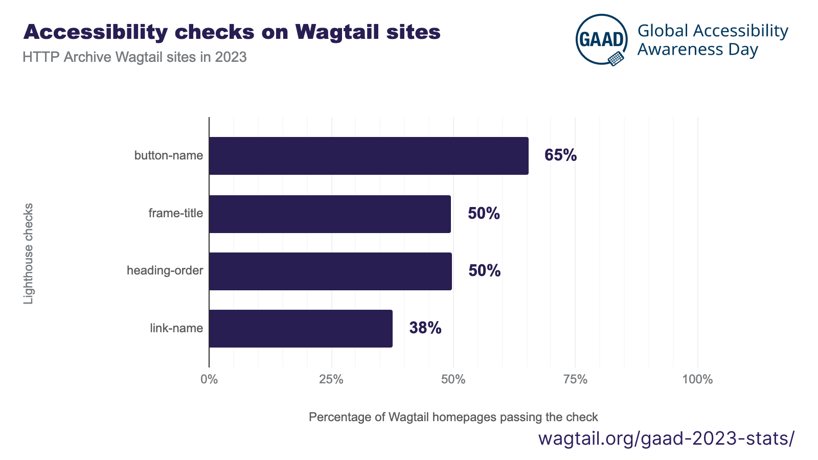
Here are 4 common issues detectable with our built-in checker:

- button-name: A button element on the page is lacking a label. This is entirely detectable with automated tests such as those featured in our built-in accessibility checker, built on Axe.
- frame-title: A frame (such as an embedded video) is missing its title. Again entirely detectable with automated tests – and very simple to fix once identified!
- heading-order: Some heading levels are getting skipped on the page – always have a main heading (h1) followed by subheadings (h2, h3, etc.).
- link-name: Just like button-name, one of the page’s links is missing its title.
All of those issues are common on the web, but with the right tests in place, there is no reason for that to remain the case.
Here is the data for this graph: Lighthouse checks, 2023-04.
Mean accessibility scores of Wagtail sites
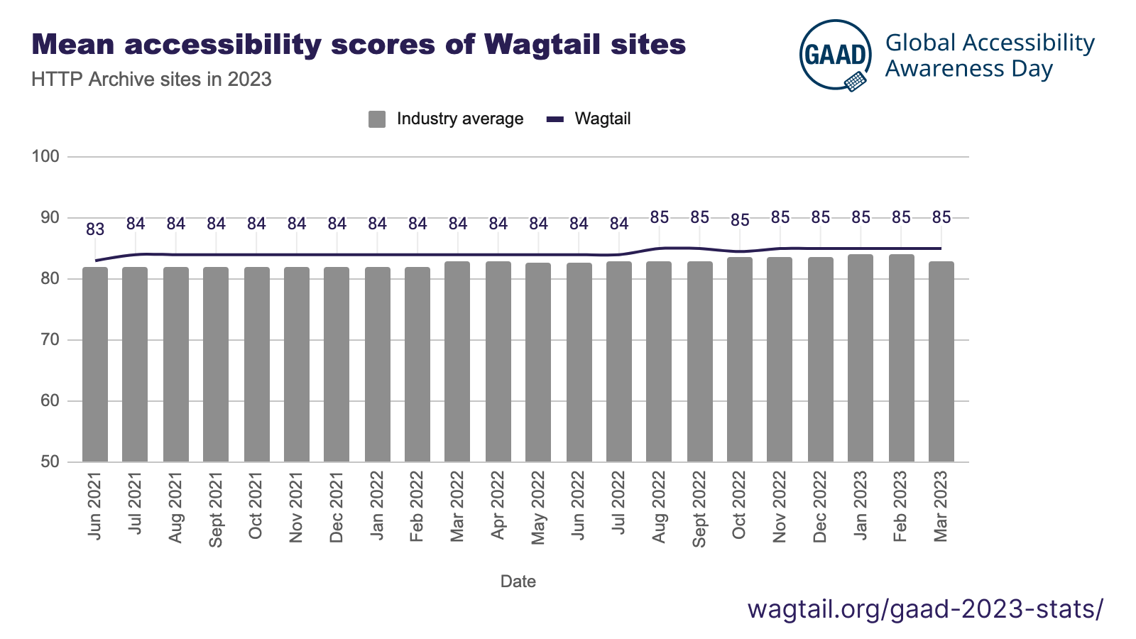
We see clear improvements over time on accessibility scores of Wagtail sites, but they’re too slow-moving:

This shows the mean accessibility score of Wagtail sites over time, compared to industry-average figures. Wagtail sites are consistently doing better – but only just.
With appropriate targets and ongoing testing, there is no reason all sites couldn’t score a perfect “100” (no issues detected) on those tests.
Data for this chart is from the Core Web Vitals Technology Report.
High contrast mode support in Wagtail sites
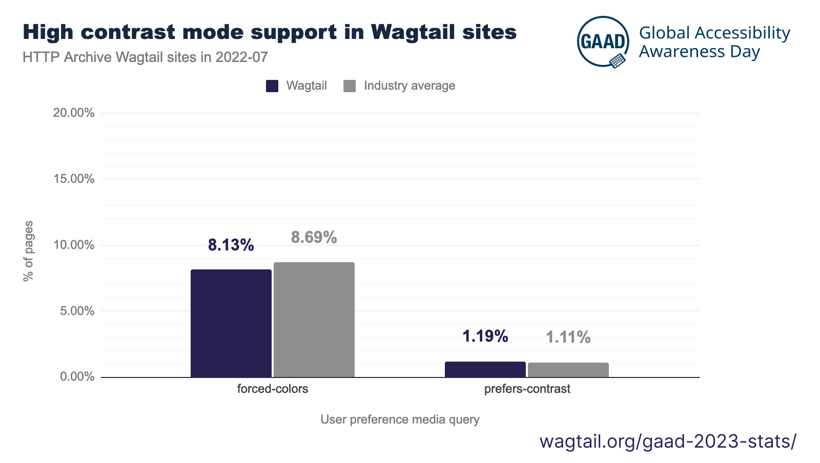
#GAAD tip #3: Support High contrast mode on your websites! Also known as Contrast themes, it allows users to adjust the color palette of the site to better suit their vision. Very few websites make adjustments to support it:

- “forced-colors” indicates a website making adjustments for users with custom color palettes – for example adding extra borders
- “prefers-contrast” indicates a website adjusting its styles based on whether users request more or less contrast, which is an option in iOS and Android
We’ve made a lot of adjustments in recent versions of Wagtail to better support Contrast Themes / High contrast mode. Here’s an example in the default dark theme:

The data for this graph is from July 2022 – to access it, have a look at Wagtail CSS media queries 2022-07.
Wagtail sites with no detected issues
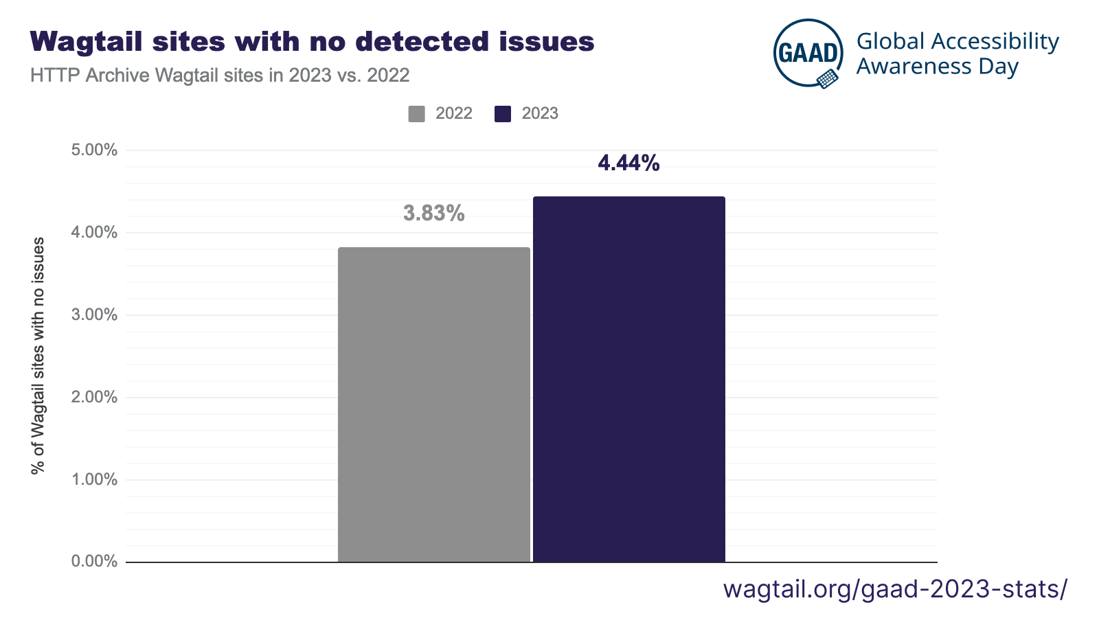
Aim higher with all things accessibility. Wagtail sites are doing better year over year, but there’s still lots to do:

We found 4.44% of Wagtail sites had no issues detected in 2023, compared to 3.83% in 2022. Those numbers are above industry averages but nowhere near our ambitions. All sites can score a perfect “0 errors” detected - and then further spend time on manual tests which can also uncover fundamental issues.
We hope our commitment to the ATAG 2.0 standard will help all Wagtail sites get there, with tools like our accessibility checker paving the way.
Here is the data for this graph: Lighthouse scores, 2023-04.
Data and methodology
The data we use comes from a dataset of the world’s top 8M website homepages: HTTP Archive. 4,000+ websites in this dataset are identified as using Wagtail, thanks to Wappalyzer.
From this dataset, we then extract specific statistics following the methodology of the 2022 HTTP Archive Web Almanac’s accessibility chapter – but filtering to only assess Wagtail projects.