Here are a couple of interview exercises I like to give, which are relatively open to varied approaches.
Before the interview: Form validation
I’ve always liked Springload’s form validation problem. It’s a relatively simple problem in apparence – implementing form validation for a basic HTML form, with a few fields, and a few validation rules.
What I think makes it really good is that it’s possible to approach this in many different ways – and there are lots of things for candidates to demonstrate beyond the basic implementation of the form validation – knowledge in any of those areas:
- Documentation
- Accessibility
- Progressive enhancement
- Browser support
- Testing
- Tooling
Form validation is a particularly interesting problem in web development because there is a fair amount of state to manage – validation errors for each fields, as well as whether the fields have been interacted with or not to decide when to display the errors.
Candidates can take a shot at this with vanilla JS, a ready-made library like Parsley, or can be asked to do this with React (Redux Forms, Formik, bespoke?), or even back-end technologies.
At the interview: Build This
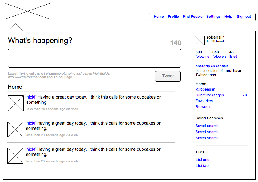
This is my go-to “how would you do this” problem, initially encountered at Codemate, which can be used to interview full-stack developers (any stack), or front-end or back-end only. The candidate is shown a specific UI (via a wireframe, screenshot, or real-world app), and is then asked to explain how they would build it within the context of a real project.
Depending on the candidate’s experience level, role, (and level of interview stress), this can be run as an open-ended conversation driven by the candidate directly, or as a series of guided themes / questions.
The whole exercise takes 30min to 1h depending on what is covered – spend a good 5 mins on the problem statement + intro & architecture, then move through the themes.
I really like this because:
- It makes for a more conversational interview – even if the questions are fixed, it’s more natural to have them with a specific app to think about.
- For candidates, it makes it easier to relate to their past work, for example reflecting on similar apps they’ve built.
- For interviewers, it does give enough structure to the interview that candidates’ answers can easily be categorised on the fly, and then compared to those of other candidates.
This works particularly well if the wireframe has quite a few things going on visually, with different types of data, a user account, and a form or two.
Template: Build This Twitter Clone

Placeholder wireframe from Rob Enslin
Fundamentals
- Introduction
- Identify the features of this UI
- Identify the underlying data / models
- Tech stack and architecture
- Rough architecture of the app (front-end and back-end)
- Overall stack, centred around
<tech we care about>
- Integrations & APIs
- Integration with the backend, endpoints and payloads
- Client-side integrations
- Data management
- State management tools with
<tech> - Data flow for a given feature (e.g. search)
- State management tools with
Electives
- Mobile-friendly UI
- RWD, cross-browser support
- Offline capabilities
- Security
- Security considerations for a new feature: user accounts with saved searches
- Testing / Tooling
- Accessibility
- Performance