I’ve heard lots over the year that “dark themes for sites use up less energy”. Last week we bought a new OLED TV, which is the first OLED device I’ve ever owned, so I finally got a chance to experience whether / how much that was true.
So I tested guide.wagtail.org, on which we recently added a dark theme, displaying the homepage with the TV plugged into a watt meter.
- With the light theme, the TV uses 63W.
- With the dark theme, it uses 34W.
That’s a stark difference but it gets worse: this TV has lots of onboard processing, so turning off the panel itself with everything else on, the TV still consumes 31W. Which means the TV panel consumes 3W to display in the dark theme, and 33W, 10x more, to display the light theme.
This reduction in power consumption only applies to OLED devices, which have a limited market share but are getting more common.
Testing a real-world website
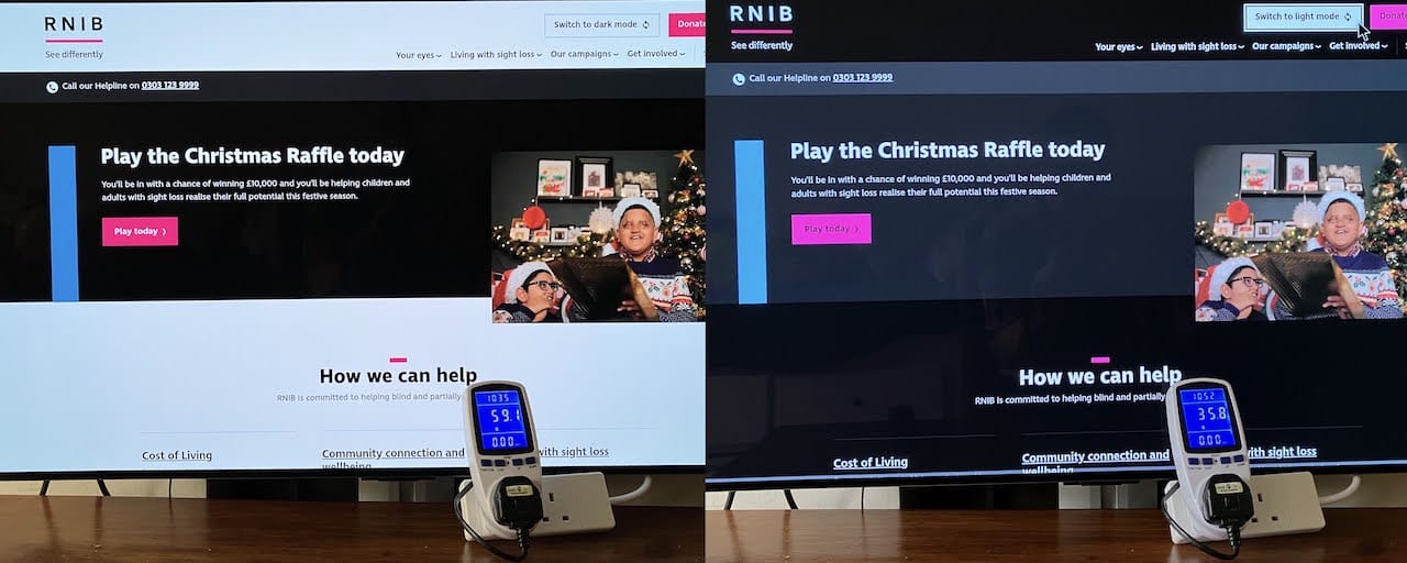
The Wagtail user guide is a real production site but doesn’t necessarly represent a typical site: it’s text-heavy, even on its homepage. Let’s now try out rnib.org.uk, for which my company recently implemented a dark theme.
Here’s the results on my TV:

- With the light theme, the TV uses 59.1W.
- With the dark theme, the TV uses 35.8W.
Assuming the same 31W for TV components other than the panel, this means a panel consumption of 28W for the light theme, and 4.8W for the dark theme. That’s a 83% reduction in power consumption.
And another example with Wagtail’s dark mode:

- With the light theme, the TV uses 57.0W.
- With the dark theme, the TV uses 33.4W.