I recently gave a talk at Wagtail Space US 2019 about making Wagtail accessible – an ongoing effort over the last few months. This is a blog post version of the same talk.
Slides: Making Wagtail accessible – Wagtail Space US 2019
There’s good news for accessibility back in the Wagtail 2.6 release notes:
Wagtail now has official accessibility support targets: we are aiming for compliance with WCAG2.1, AA level. WCAG 2.1 is the international standard which underpins many national accessibility laws.
Wagtail isn’t fully compliant just yet, but we have made many changes to the admin interface to get there. We thank the UK Government (in particular the CMS team at the Department for International Trade), who commissioned many of these improvements.
Why this matters
For users of assistive technologies, using Wagtail’s admin interface can be difficult. Organisations shopping for a CMS also are very aware of accessibility – because of legislation that mandates compliance with accessibility standards (NZ, USA, EU, UK, and more).
We also simply want Wagtail users to have a good experience, regardless of how they access Wagtail. And accessibility improvements for people relying on assistive technology usually also lead to usability improvements for everyone.
And this reasoning also applies beyond Wagtail – whether you’re building working on an intranet platform, CRM, ERP, dashboard tools. Building an internal app with the Django admin. The same standards should apply, even if the audience is smaller or restricted to a specific organisation.
What we’ve done so far
We started by setting our target: compliance with WCAG 2.1, AA level.
- Why WCAG2.1? Because it’s a well-established standard internationally, and the basis of many national accessibility laws.
- Why AA level instead of AAA? Because AAA compliance generally mandates a lot when it comes to visual design, and it didn’t feel realistic. AAA-level compliance will be achieved on some parts of Wagtail, but not all of it.
To complement this target, we also decided to make a shortlist of specific assistive technologies we wanted to support and use in our testing:
- NVDA on Windows with Firefox ESR
- VoiceOver on macOS with Safari
- Windows Magnifier
- macOS Zoom
- Windows Speech Recognition
- macOS Dictation
- Mobile VoiceOver on iOS, or TalkBack on Android
Like for cross-browser testing, having explicit targets helps a lot in understanding what to test. When choosing those targets, we tried to have a representative selection of assistive technology in use (thanks to the 2016 GOV.UK assistive technology survey), but also choose tools that we could reasonably expect people contributing to Wagtail to install and test with. There are things not covered here – high-contrast modes, dyslexia fonts, etc.
Tooling
To assist with our audits and accessibility testing we picked a selection of tools centred on Axe, an accessibility rules engine. We specifically chose three integrations of Axe:
- Accessibility Insights – a set of accessibility compliance browser extenstions, built upon Axe for automated checks.
- Pa11y – Command line tool for accessibility checks with Axe & HTML_CS.
- React Axe – integrated directly in our build tools, to identify actionable issues. Logs its results in the browser console.
Here again, our choice of Axe over other tools is largely thanks to excellent work from the GDS – its accessibility tools audit in this case. While Axe doesn’t top this list, it has one of the lowest rates of false positives, making it particularly suitable for automated tests, which are paramount for an open-source project with a lot of contributors.
To make the most of those tools, we also worked on an automated accessibility and visual regression test suite, which helped us seeing our progress as we started fixing issues.
Audit
There is no better start to an accessibility push than an audit – to understand where we are at, create a backlog of improvements to improve the user experience, and reach compliance. Auditing can be automated (to cover lots of UI at a high-level), semi-automated , or fully manual (to have a more qualitative assessment).
But first – we needed to figure out what to audit. We made a big spreadsheet:
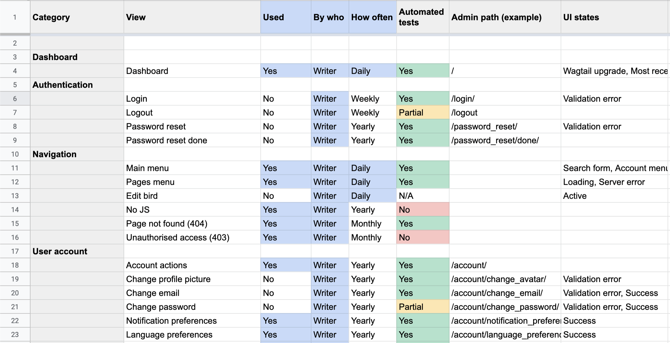
…and from there, we could start to audit our way through the Wagtail admin!
The results
- We identified 344 different scenarios / parts of Wagtail to test.
- We tested 189 of those 344.
The discrepancy between the two is due to the scenarios either being seldom used (e.g. Sites management), hard to reach, or hard to test (e.g. the inside of the datepicker).
From this, we found 336 issues via automated testing 🙀. While this can feel like a big number, there were a lot of issues that were duplicated between the different parts of Wagtail, and a few false positives as well. But 336 is a big number nonetheless.
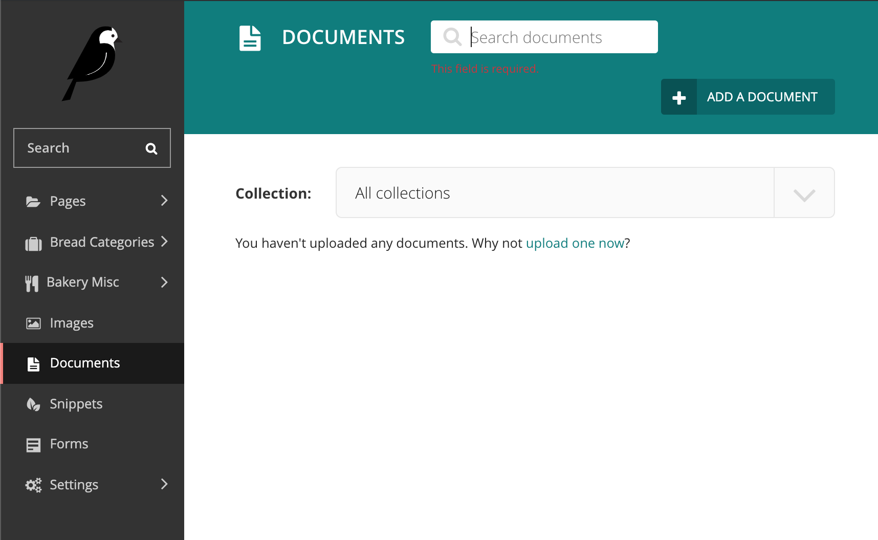
The issues
We made a big spreadsheet with the 336 automated test failures, and the manual ones too. It’s not that interesting to look at (and a lot of them have been fixed since!), but let’s have a look at a selection of my personal favourites.
Colour contrast
Can you spot the error message? Hint: it’s red.
What can we learn from this? Testing all variations of a given UI is mandatory – focusing on the “success” path is not enough.
If you can’t see colours, can you tell which message is a warning, and which one is a critical error? Hint: one is slightly darker.
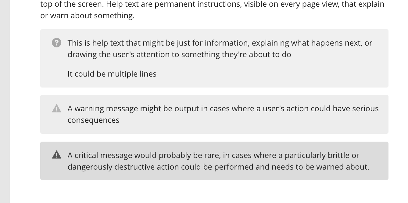
Here, the takeaway is to never rely on colour alone. Sure – the messages come with icons, but they are identical for warnings and critical messages.
Focus outlines
Can you spot where the focus is? I can’t either.
Good, consistent focus styles are fundamental to an interface being usable with the keyboard. Don’t build different styles for each component.
Tab stops
Tab stops are a measure of how many “tab” presses are needed to reach a given part of the page. Wagtail currently doesn’t score well at this, to say the least.
As a bonus, here is a recording of testing Wagtail 2.5 with a screen reader:
What we fixed
Quite simply, we went from 336 to 172 issues, with the remainder essentially on parts of Wagtail we chose not to cover (yet!). The Wagtail 2.6 release notes have more information about the fixes:
- Better text-to-background color contrast across the whole CMS
- Increased font size across the board as well
- Added focus outline styles
- Added more ARIA landmarks and refactored heading structure
- Added a lot more contextual information to links for screen reader users
- Fixed the icons implementation (more or less)
- Fixed focus not moving to the pages explorer
Up next
Even though this was a wonderful push to make Wagtail more accessible, in practice this really should be part of ongoing development. Accessibility should be taken into account in the design & dev workflow for any UI changes. Contributors to Wagtail should have clear information on what to do to make sure they build accessible UIs.
We’re not there yet, but you can follow our progress and get involved by:
- Looking at the accessibility RFC: Making Wagtail Accessible for users of assistive technologies. Comments welcome!
- Reviewing our backlog: WCAG2.1 AA compliance project on GitHub.
- Joining us on Wagtail’s Slack workspace, in the #accessibility channel.
And last but not least, this year we are organising a Wagtail sprint focused on accessibility in Bristol.
References
- Issue #4199: Making Wagtail Accessible for users with disabilities
- NZ: Web Accessibility Standard
- US: Section 508
- EU: Directive on the accessibility of public sector websites and mobile applications.
- GB: The Public Sector Bodies (Websites and Mobile Applications) (No.2) Accessibility Regulations 2018
- Wikipedia: Universal design
- WCAG2.1 conformance levels
- W3C: Web Accessibility Laws and Policies
- Axe: Accessibility engine for automated Web UI testing
- Pa11y: your automated accessibility testing pal
- A maturity model for design systems
- Deque: What is Shift Left Accessibility Testing?
- Wagtail 2.6 release notes
- WCAG2.1 AA compliance roadmap
- Accessibility support targets & tooling setup (#4871) #5245
- RFC 37: Making Wagtail Accessible for users of assistive technologies