Here are the results of an accessibility audit I did for Django Postgres Metrics, as part of the DjangoCon Europe 2021 sprints. I recorded myself going through this and put it up on YouTube, so we have a demo for each of the issues: DjangoCon Europe 2021 sprints – Accessibility review of Django Postgres Metrics.
TL;DR; 01:15:15
TL;DR; in video form: 01:15:15
- Most issues come from Django for the UI, and the RTD theme for the documentation
- Great effort on translations and RTL support! It’s wonderful to see this being done as a baseline
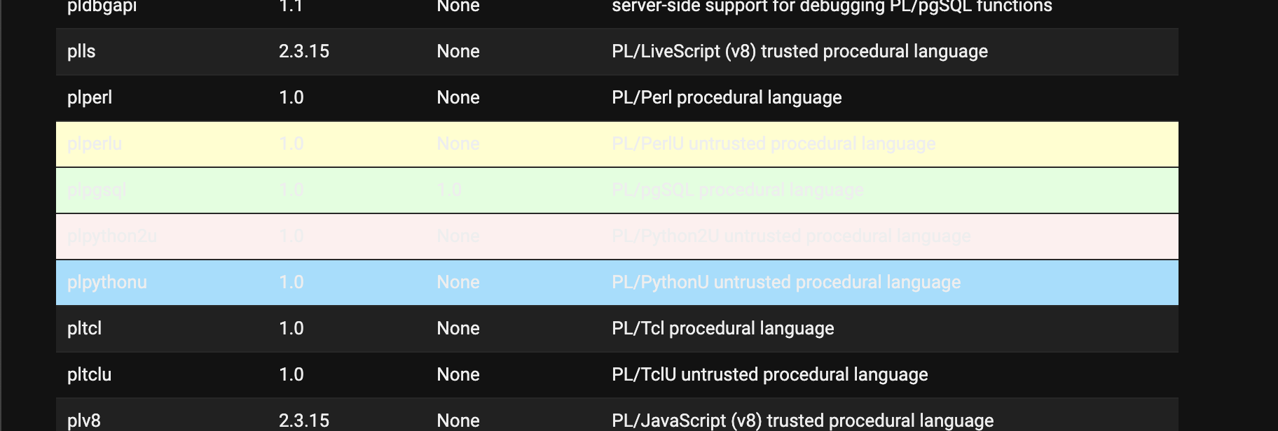
- Very semantic tables markup, which definitely matters for the metrics’ display
- Some issues from this package with dark mode support, which make the library potentially unusable for dark mode users. Fixed in #59.
- There are a few improvements for screen reader users to be done here and there
- Table sorting was particularly hard to follow with a screen reader, although I suspect this is the Django implementation
About the audit 00:01:05
Scope:
- HTML templates in GitHub
- UI in the Django admin (minimal customisations)
- Documentation in README
- Documentation in Read the Docs (default sphinx-rtd theme)
Methodology:
- Automated tests with Accessibility Insights with Chrome
- Keyboard navigation (tab stops)
- Color contrast
- Dark mode support
- RTL support
- Mobile support
- Screen reader navigation (VoiceOver in Safari)
- Other things picked up along the way
HTML templates 00:02:22
index.html:
- There are a lot of links with the
titleattribute being used in. This can be announced multiple times by some screen readers, so I would suggest not usingtitlewherever it matches the visible label of the link - Table markup for the navigation in
index.htmllooks great, however this would be much quicker to navigate with a screen reader by using simpler markup, for exampleulwith a list item for each link.
table.html:
- Place the breadcrumb in a
<nav aria-label="Breadcrumbs"></nav>landmark, so screen reader users can bypass it or reach it more easily - Add
aria-current="page"to the current page so it’s announced as such. Fixed in #58.
UI 00:07:38
Automated tests with Accessibility Insights with Chrome
- A lot of color contrast issues, but I believe they all come from Django itself
Keyboard navigation 00:12:35
- Missing a skip link on all pages – Django issue
- On metric pages, I found it a bit odd how the tab focus moves from the breadcrumb, to the package’s nav to the right, and then back to the metrics on the left. It’d be better to go straight from breadcrumb to the metrics’ tables.
- Likely a Django issue – the tab order for sorting is unexpected (right-to-left)
Color contrast
- In the package’s views in the “POSTGRESQL METRICS” nav, there isn’t enough contrast between the “active” menu item and the other ones, so people won’t be able to tell which menu item is active. This is both for the text, and the “selected” indicator”. I would suggest adding an underline to the text. 00:26:24
Dark mode 00:16:03
- None of the package’s
ok,warning,critical,infostates work in dark mode. They make the table’s contents completely unreadable. A solution would be to use@media (prefers-color-scheme: dark)styles like Django does, however I would recommend another approach that doesn’t rely on background color as the color also won’t be picked up by blind users – it’d be better to represent those 4 states with an icon, that could then have a text alternative, or just a label. Fixed in #59.
Illustration:
RTL support 00:19:20
😐 I did all of my testing without having configured the language in Django settings, forgetting Django uses this to set LANGUAGE_BIDI and load the correct stylesheet. As far as I can tell there are no issues here!
Mobile support 00:24:15
(this is more “small browser” support really, I didn’t do any touch navigation testing)
urlized links cause the page to overflow and scroll in 2 directions at once. That’s bad. For this, and for screen readers, I’d recommend using proper link labels.- Tables also cause the page to overflow and scroll in 2 directions. It would be better if they overflowed the page but the overflow was scrollable for the table separately (wrap the table in a
<div>withoverflow: scroll). - With the way tables resize currently, they cause some of the cells with long values to reflow, which makes big numbers harder to read in my opinion. Scroll would be better in this instance.
Screen reader navigation (VoiceOver with Safari) 00:30:00
Dashboard:
- Django issue – the views should be using ARIA landmarks to facilitate navigation.
- Prefer displaying “POSTGRESQL METRICS” in TitleCase or lowercase as much as possible, rather than uppercase, as TTS is prone to mispronounce PostgreSQL if it’s all uppercase.
- The “show” link need a more descriptive label for screen reader users (with
aria-label) so they can be understood without the visual context the links are in on the page. Alternatively, remove those links, as they do the same thing as the link next to them that has a better label already. Fixed in #58. - Django issue – duplicate h1 heading
Metrics views:
- All of the custom views are missing a
<title>matching the<h1>00:15:15. Fixed in #58. - Prefer to use links with human-friendly labels over
urlizeURLs. These don’t announce very well with screen reader text-to-speech unless the user knows how to navigate word-by-word or character-by-character 00:11:18 - Django issue (?) I found the table ordering to be very confusing
- Consider adding spaces around
=signs in table captions so screen readers TTS have a better chance of pronouncing the text correctly - Currently the warning/info/ok/critical status are invisible for screen reader users. I’d suggesting adding a screen-reader only label, or an icon + label
- Some of the larger numbers in the tables are pronounced as identifiers (“one three five”) rather than numbers (“one hundred thirty five”). Consider adding numeric separators to make numbers more readable for humans and text-to-speech.
Other things picked up along the way
- The bigger values in tables are picked up by my browser as telephone numbers. This might warrant a
<meta name="format-detection" content="telephone=no"/>.
Docs in README 00:53:15
- The project’s name
django-postgres-metricsis being read letter-by-letter by VoiceOver, unless I manually switch to word-by-word navigation. In the main heading, I would suggest switching toDjango Postgres Metricsto make it more likely for people to understand what the project is. - The badges’ alt text should match the text on the images. This is likely impossible, but I’d suggest changing alt text to match the visible text more closely. Fixed in #58.
- Python and Django versions badges should link to some place those versions are available in text format (or add the versions hard-coded in the alt text). Fixed in #58.
- It would be nice to use more descriptive alt text for the screenshot. Fixed in #58.
- The “AT” and “DOT” in the email address are read as acronyms. Would be nice to replace with lowercase variants so they are read as words. Fixed in #58.
Documentation in Read the Docs (default sphinx-rtd theme) 01:00:45
Automated tests with Accessibility Insights with Chrome
- Too many issues for me to count, all with the theme itself I expect
Keyboard navigation (tab stops)
- Missing a skip link
- The RTD version picker is impossible to reach
Screen reader navigation (VoiceOver with Safari) 01:05:45
- A lot of RTD issues at the theme level
- RTD ads are particularly poorly done
- There are two
h1in the index page. Fixed in #58. - The RTD version picker is reachable, but impossible to open